A Silver Lining In The Wake of Coronavirus?
March 7, 2020
As I wait to receive the final proof for the TSP Investing Strategies 2nd edition by mail, I’ve been looking through stats related to health and COVID-19 (I know, fun right…?). Looking through influenza reporting on cdc.gov, I noticed an interesting trend that, while early, might present a bit of a silver lining to what we’re starting to experience right now.
If we can find a silver lining in this whole episode, it might be this: The seasonal influenza and pneumonia mortality rates have trended downward significantly in the first two months of this year, according to weekly figures reported on the CDC website, which is in turn based on National Center for Health Statistics (NCHS) data. (See the “view chart data” link for the actual data set.)
Take a look at this:
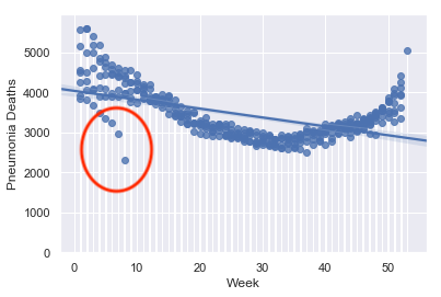
This chart shows the weekly mortality due to pneumonia for every year from 2014 to early 2020, plotted by week. Most years follow the same general pattern, with higher mortality at the beginning of the year (weeks 1-10) and at the end of the year (weeks 45-53: 2014 had 53 weeks of measurements, hence the outlier at the far right). Mortality rates trend lower over the summer months. In this graphic, you can see a significant drop in the pneumonia mortality rate especially in the week 5-8 timeframe, circled. These are the weekly figures for 2020: I purposely did not color-code or otherwise mark the data points by year in order to focus on the overall trend for the six+ years and to avoid clutter in the graphic, but the drop in 2020 is quite notable.
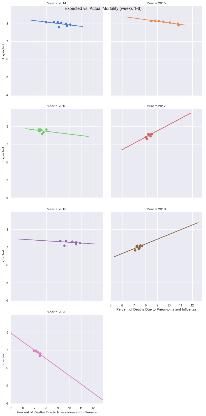
The CDC/NCHS data also includes “expected mortality” and “actual mortality” due to influenza and pneumonia as a percentage of total deaths for a given week. In the most recent reporting, the expected mortality to actual mortality rates have dropped significantly this year compared to previous ones, as you can see below. I graphed this data out by year with trend lines, comparing just the first eight weeks of each year since 2014. The y-axis represents the expected mortality rate, and the x-axis represents the actual mortality rate. While some of the years have trended slightly downward, the data for 2020 shows the steepest downward trend of all the years. Moreover, the data points are also the farthest to the left on the x-axis of all the years, indicating that the percentage of deaths due to pneumonia or influenza in the first eight weeks of 2020 are the lowest for all the years shown below.
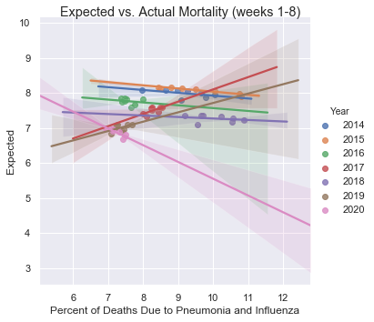
To better compare this last point, I plotted all the years and trend lines on one graphic. Note how the 2020 data points (in pink) are farthest to the left, and they feature the steepest downward trendline at this point in the year compared to previous years.
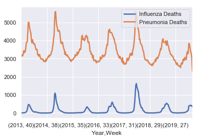
Here is the overall trend in mortality since late 2013. Pneumonia mortality had trended downward since 2013, but as you can see in the far-right of the graphic, there is a steep drop-off in the figure. Influenza mortality rates seem to be dropping too, but from a lower figure especially when comparing with 2014-15 and 2017-18.
These significant drops are no doubt the result of a combination of factors, from laser-like focus on good sanitizing techniques (such as thoroughly washing and sanitizing hands and work areas frequently), social distancing, a decrease in travel domestically and internationally, and a decrease in attendance at large events.
These latter developments, driven by COVID, will most definitely impact the global economy in the short term. How long the impact lasts will depend first and foremost on the severity of COVID and how quickly effective treatments or a vaccine can be developed. But in my opinion - and based on research and data I present in TSP Investing Strategies - now is not the time for buy-and-hold investors with long investing horizons to sell their stock holdings during major market declines. Rather, they can be opportunities, as they have presented themselves in the past. See, for example, the 2008-9 timeframe (when there was a major H1N1 flu outbreak in addition to the financial meltdown) and resultant ten-plus years of returns, in the interactive returns calculator in the “TSP Calculators” section of this site.
Here’s hoping that the actual mortality rate, even with coronavirus factored in, continues to remain subdued…
Stay safe, everyone!
Related topics: long-term-investing tsp-updates