Apps? We Don't Need No Stinkin' Apps!
October 30, 2013
TSP administrators announced last week that they have deployed a new version of tsp.gov that allows users to log on to their accounts using a browser on their smart phone.
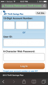
Instead of developing and deploying a specific app for the iOS and Android (KitKat et al) operating systems – not to mention Microsoft Mobile and Blackberry OS – users can access the TSP site using their mobile browser to get a version of the site that is optimized for the smaller screen. Here’s the iOS7/Safari version:

According to the press release:
“…the Federal Retirement Thrift Investment Board (FRTIB) deployed a mobile version of the TSP website, tsp.gov. This relies on ‘responsive web design’ to provide an optimal viewing experience based on the type of device the participant is using to visit the website. Participants do not need to download an app to enjoy this experience.”
I’ve only used the mobile version a couple of times thus far, and while the interface takes a little getting used to, after clicking around for a few minutes I was able to get all the account information I was looking for. I haven’t made any transactions on the mobile version yet, though.
My one critique would be that the main online version blacks out both my user ID and password when I access it on my computer at home, while this version only blacks out my password. I’d prefer that both were blacked out. (I’d also prefer a password that is not limited to 8 characters, but that’s a different issue…)
While “enjoy” is not a word I would use to describe my “experience” — I’m sure there’ll be times when I dread the experience depending on how the markets perform — the new mobile version is an easier interface for checking my balances than trying to access my account through the main site on my computer. So while I’ll continue to conduct inter-fund transfers on my home computer, I’ll probably end up using my mobile more often to check my balances.
Related topics: tsp-updates